Back
Web Platform · Hospitality

All-Inclusive Resort Website Redesign

Client
Salinas Resorts (Amarante Hospitalidade)
Role
UX/UI Designer
Summary
UX/UI redesign for Salinas Resorts, two of Brazil's most awarded all-inclusive destinations: Salinas Maragogi and Salinas Maceió. Customers were frequently booking the wrong resort, so the redesign introduced a color differentiation system (orange for Maragogi, blue for Maceió) and a dedicated entry page to guide users to the right property. The project contributed to a 49% profit increase and 88% occupancy rate in 2014, and the color strategy proved so successful it became the company's permanent brand identity. I later led the 2017 redesign to launch that new branding.
Salinas Maragogi and Salinas Maceió brand logos side by side — both tagged All Inclusive Resort. UI Design and UX Design disciplines. Project introduction text explaining the challenge of designing two resort websites with distinct city-based color systems. Vibrant underwater photography background.

Problem

Salinas Resorts faced a major usability challenge across its two resort websites, Salinas Maragogi and Salinas Maceió. Customers frequently confused the properties and accidentally booked the wrong resort, creating frustration for guests and operational issues for the business. The company needed a clearer and more intuitive digital experience capable of helping users easily differentiate the resorts and confidently complete their bookings.

Solution

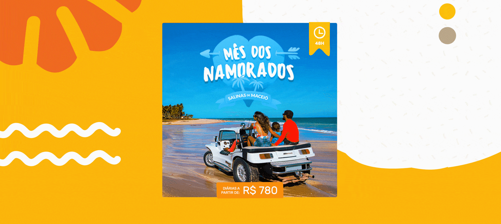
The experience was redesigned to clearly separate the identity of each resort while maintaining a connected ecosystem between them. Dedicated websites were created for each property, allowing users to switch resorts at any time. A visual differentiation strategy was introduced using orange for Salinas Maragogi and blue for Salinas Maceió, helping customers instantly recognize which resort they were browsing.

An entry page was designed to guide users in selecting the desired destination before entering the experience. The navigation structure was simplified around customer interests, including accommodations, resort amenities, all-inclusive offerings, entertainment, services, destinations, and special deals. The experience also leveraged immersive photography showcasing beaches, family activities, and the all-inclusive lifestyle, reinforcing the concept of a complete vacation experience.

Results

The new website structure and information architecture significantly improved navigation clarity and customer understanding. According to Fernando Holanda, Marketing Director at Salinas Resorts, the redesign became "one of the important tools for the growth of 49% of the profit in relation to the previous year." In 2014, the occupancy rate increased to 88%, representing a 4% growth compared to 2013.

The project became a reference for resort websites in Brazil, with competitors adopting similar UX and visual strategies. The color differentiation system proved so successful that it evolved into a permanent branding strategy for the company. In 2016, Salinas Resorts officially incorporated the orange and blue distinction into its visual identity during a corporate rebranding initiative.

Two years later, the company launched a redesigned version of the website aligned with the new branding while preserving the successful information architecture created in the original project. I led the end-to-end UX and UI design for that redesign initiative.

Resort selection flow — center screen showing the Salinas split landing page with Salinas do Maragogi and Salinas de Maceió side by side, with orange arrows pointing down to the two branded homepages: Salinas do Maragogi (orange theme, Diversão em família hero) and Salinas de Maceió (teal theme, aerial resort view). Orange background with colorful confetti accents.

The color differentiation system introduced in the UX/UI solution proved so successful that it evolved into a permanent branding strategy, inspiring the new visual identity for the resorts.

Brand rebrand before and after — left panel shows logo evolution: Salinas do Maragogi old neutral logo updated to a bold yellow handwritten logotype; Salinas de Maceió old blue waves logo updated to a bold teal handwritten logotype. Right panel shows resort photography before and after: Maragogi pool area with generic umbrellas becoming yellow-branded umbrellas; Maceió beach with old branded umbrellas becoming new blue-branded umbrellas. Experience Overview — orange section divider slide with white uppercase text.

Salinas Website Redesign (2017) to launch the new branding

In 2016, I led the website redesign that marked the launch of the resort's new visual identity. The project aimed to create an immersive experience that showcased the natural beauty and structure of the resorts through rich photography and video content. The redesign positively impacted sales and reinforced Salinas Resorts as a reference for digital experience among all-inclusive resorts in Brazil.

Salinas Maragogi full website — homepage with hero photography, 'Confira Nossas Promoções' promotional banner grid, Diversão / Crianças / Atividades activity sections with full-bleed photography, aerial resort view, and complete footer. Two desktop page sections — Diversão with activity illustrations and underwater photography carousel; O Resort with aerial resort photography and descriptive copy. Color palette shown: orange/coral and teal accents. Animated promotional banner for Mês dos Namorados — Salinas de Maceió — diárias a partir de R$ 780 — featuring a couple in a beach buggy with a 48-hour countdown badge. Responsive Design — three mobile screens of Salinas Maragogi: O Resort hero section, Mês dos Namorados promotional banner, and Diversão activity listing with illustrated icons. Salinas Maceió full website — teal-branded homepage with booking form (Faça Sua Reserva), promotional banner grid (Férias de Julho, Mês dos Namorados), Diversão / Crianças / All Inclusive sections, video experience section, Facebook social proof (1,471,523 followers), Maceió destination highlight, Blog preview, and footer with TripAdvisor award and 4,065 reviews. Salinas Maceió — Diversão section with activity illustration grid and pool photography; O Resort section with aerial beach view. Color palette: orange/coral, teal, white, light grey. Responsive Design section with three mobile screens showing homepage, Confira Nossas Promoções, and Spa page. Wireframes — desktop wireframes for Salinas Maragogi showing Destaque hero, Acomodações room grid, O Resort section, booking bar behavior (collapsed and expanded states). Mobile wireframes showing main menu, booking bar with WhatsApp CTA, Acomodações room configuration, newsletter signup, and Diversão / Crianças / All Inclusive sections. 04 Experience Overview — orange section divider slide with white uppercase text.
Closing slide — salinas.com.br — Thanks for watching! — irvingsuna.com — on an orange background with yellow wavy lines and yellow smiley face.

Want to learn more about this project?
hello@irvingsuna.com