Financial App Settings

Problem
NestBuddy aimed to help households with limited financial knowledge better manage expenses and financial goals. The challenge was to design a clear settings experience where users could manage profiles, notifications, expense categories, and security preferences without friction.
Solution
I conducted competitor analysis, user interviews, empathy maps, personas, and journey maps to understand what users needed. Based on that research, I designed a clear settings architecture and built it through low and high-fidelity prototypes, usability testing, and responsive design across desktop, tablet, and mobile.
The project also included custom icons, animations, style guides, screen flows, and reusable components.
Results
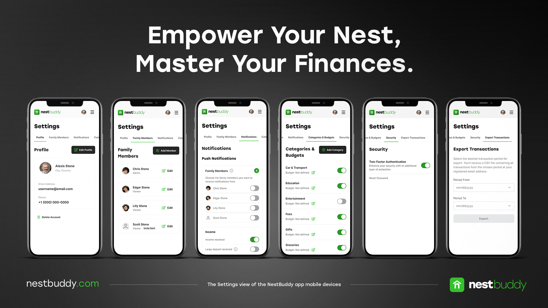
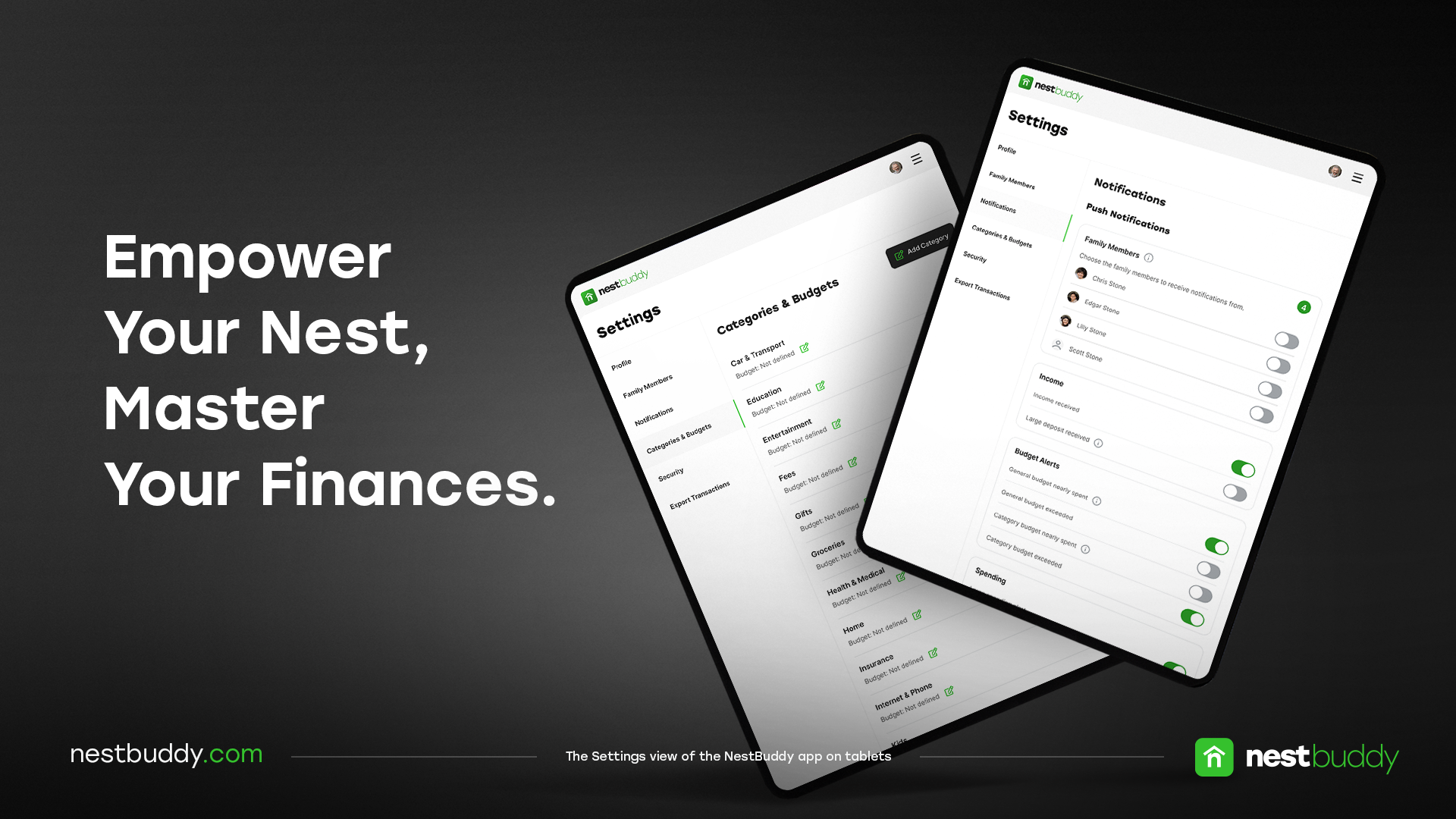
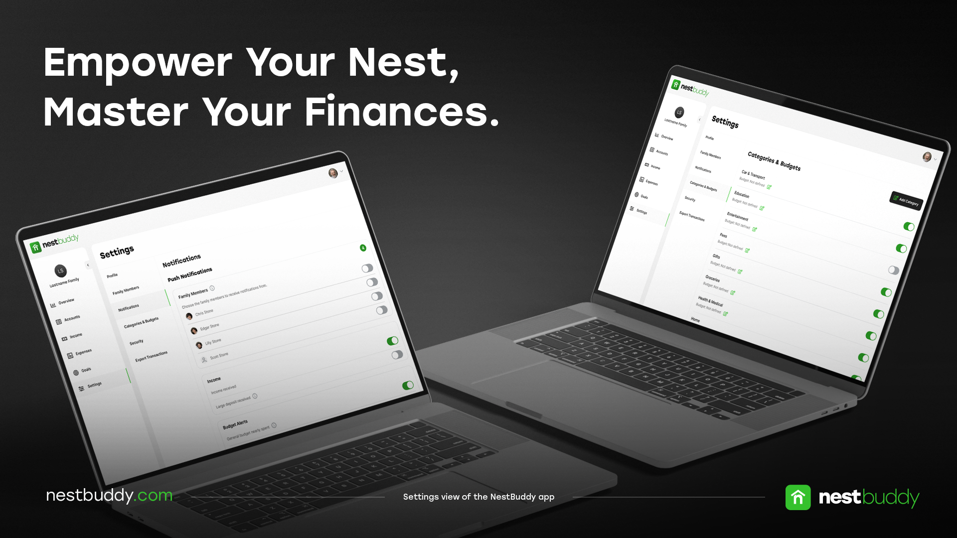
I delivered responsive UX/UI for desktop, tablet, and mobile within 10 weeks, including high-fidelity prototypes, custom icons and animations, style guides, and reusable components.
User interviews and usability testing helped validate and refine the experience, resulting in a clearer settings flow for the intended users.
Design Process
See Full Process Book (PDF)Research
I started by understanding the product, the market, and the users. This meant researching competitors and talking to people to learn what they needed and where they struggled.
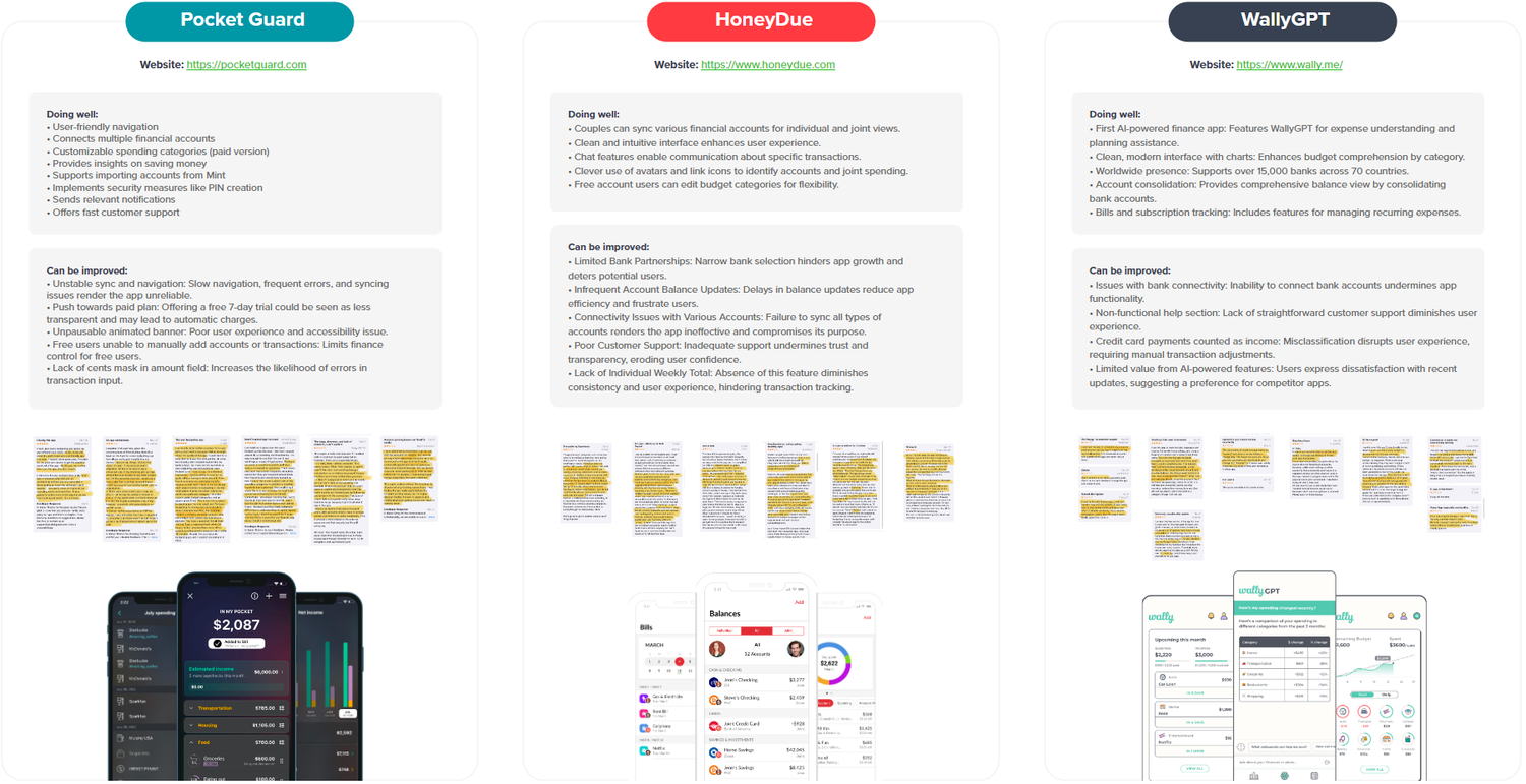
Competitors
I started by analyzing three competing apps, looking at their strengths and weaknesses. I collected customer feedback from app stores and did a hands-on walkthrough of each product to evaluate the experience directly. The analysis helped identify gaps and areas where NestBuddy could do better.
Empathy Map
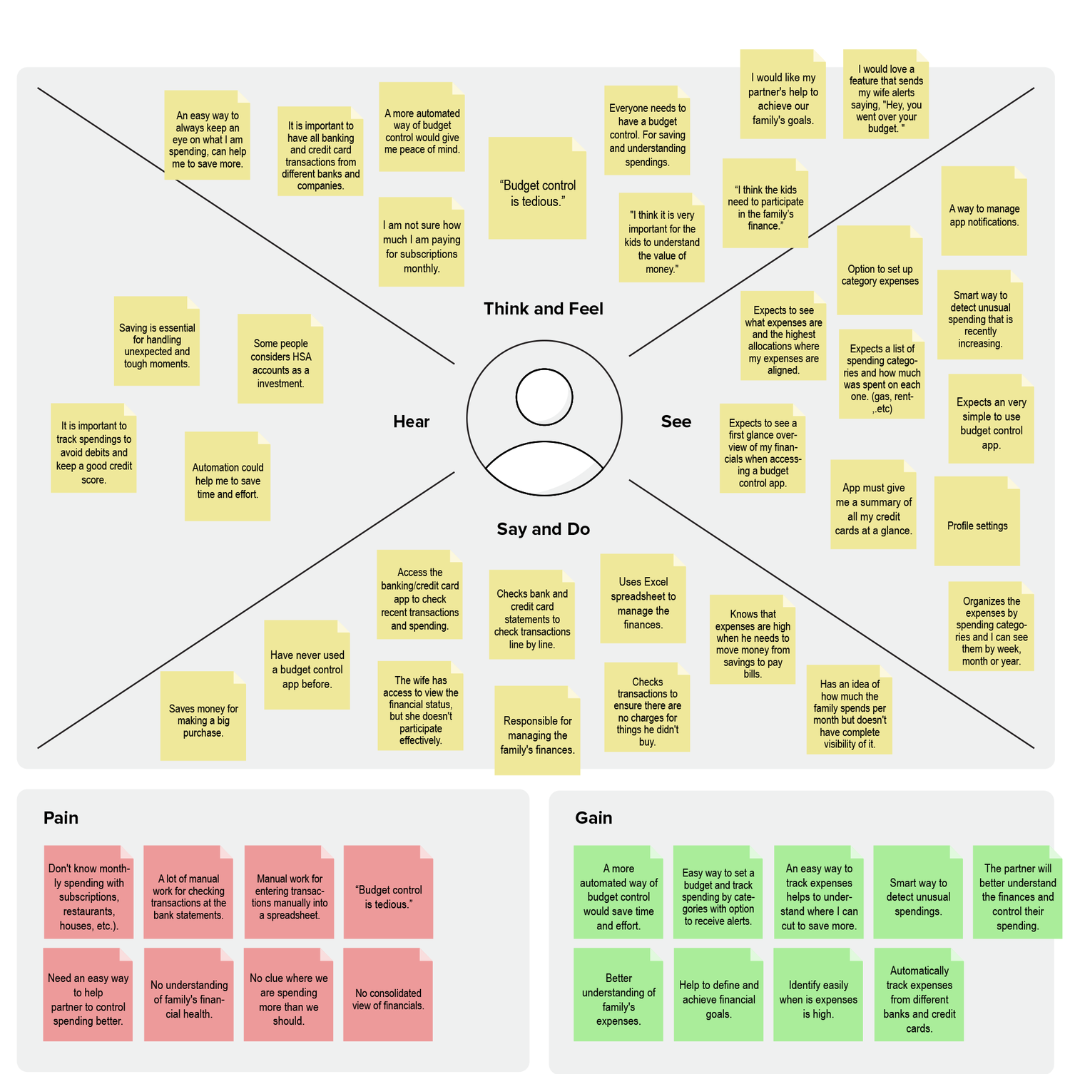
After the competitor analysis, I shifted focus to understanding the users. I conducted interviews with three people from different family situations to learn about their motivations, concerns, and how they managed household finances.
Before each interview, I used screening questions to confirm participants matched the target user profile, covering their family status, how they tracked expenses, and their general approach to budgeting.
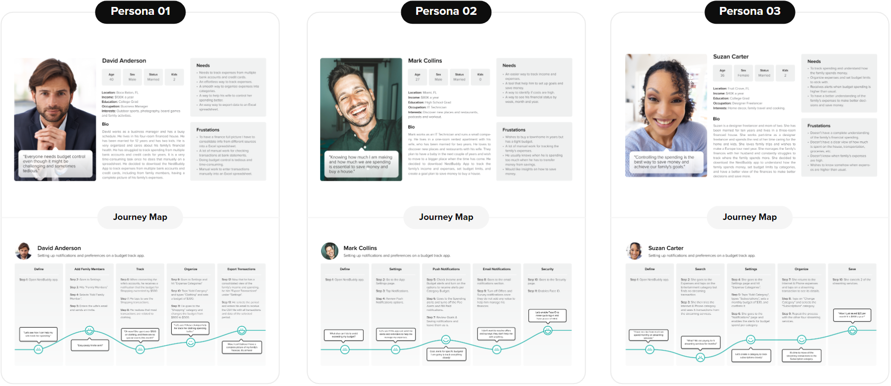
Personas and Journey Maps
Based on the interview findings, I developed three personas representing different types of users. Each persona also had a Journey Map showing the steps they would take to manage their finances and where friction might occur.
Sitemap
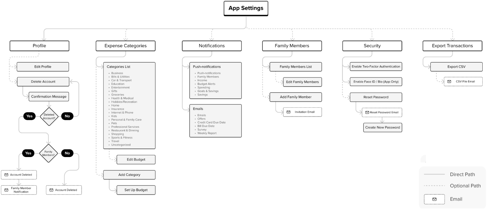
The research and journey maps helped me identify the key features needed, which I used to draft the settings sitemap.
After identifying the main functionalities, I ran a design exercise to map out the sections needed. I used Post-it notes on paper to quickly test different sitemap configurations, then created the first version in Figma.

Site Map Interviews
After mapping out the main sections and subsections, I ran a card sorting exercise with three users. I asked them to prioritize the settings menu by importance and share any suggestions for items they felt were missing.

Main Findings
- •Most users expected to see the Profile option listed first in the Settings menu.
- •Many users placed Family Members near the Profile section.
- •There was no consistent pattern for where users placed Notifications, though most put it toward the upper-middle of the list.
- •Security and Export Transactions were seen as necessary but consistently placed near the bottom.
- •One user suggested adding an option to delete the account.
- •Another user recommended including a help and support section.
Improvements made on the Sitemap
- •Reordered the Settings menu items based on user priorities.
- •Added the Delete Account option to the Profile page.
- •Renamed Expenses Categories to Categories & Budgets to better reflect that budgets can be set in that section.
- •The suggestion for a Help and Support section was noted but not included in the Settings menu at this stage.
Site Map After Interviews
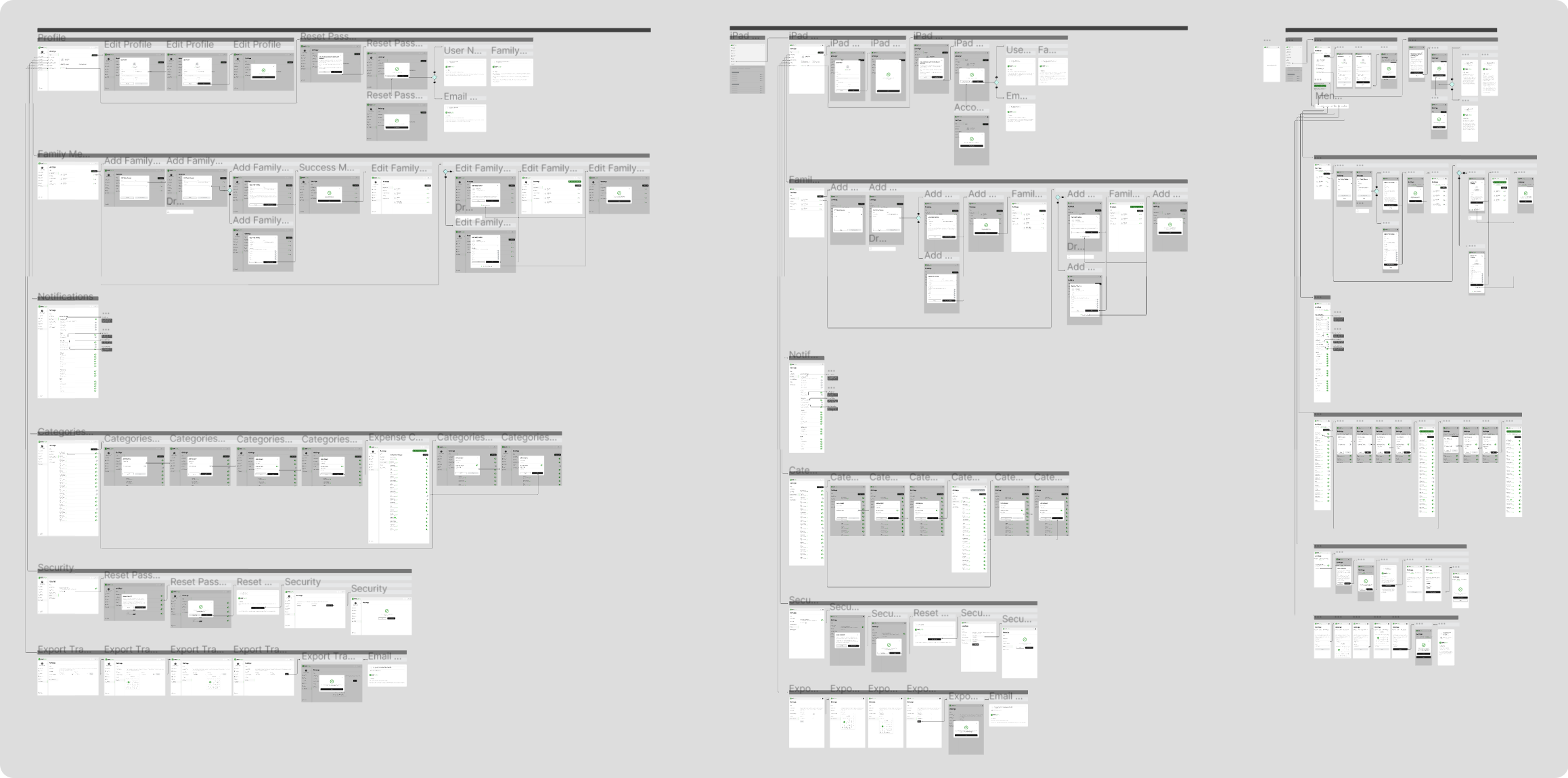
Low Fidelity Wireframes
Once the sitemap was in place, I sketched out ideas for desktop and mobile screens, then turned those sketches into low-fidelity wireframes in Figma.
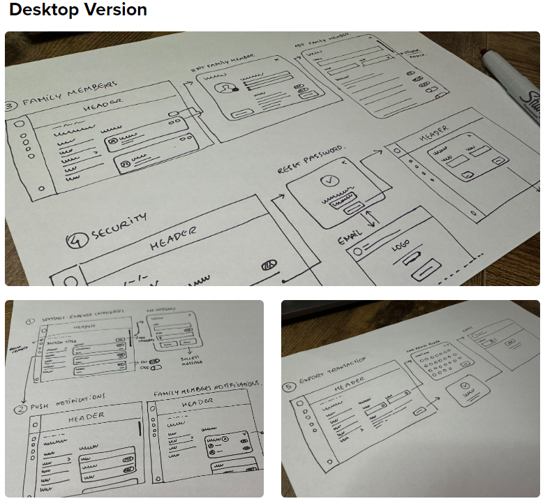
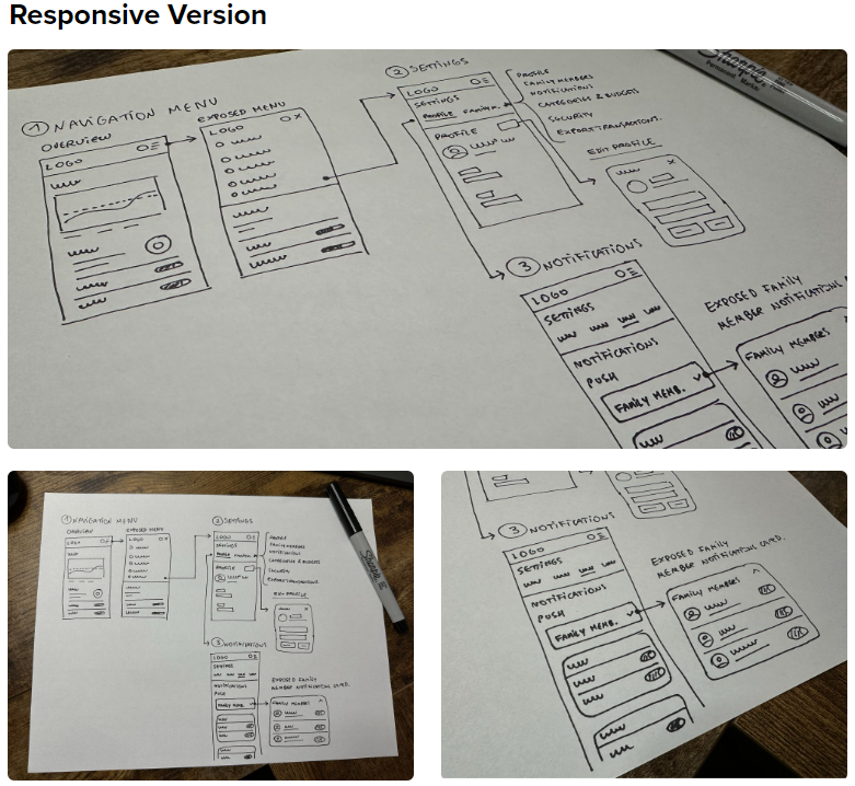
Wireframes
Usability Testing
After creating the low-fidelity wireframes, I developed an interactive prototype and a usability testing script to observe user interaction and collect feedback.
Changes made based on the users' feedback:
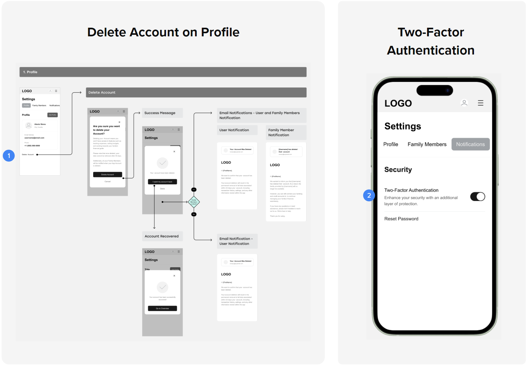
- 1.Moved the "Delete Account" option to the Profile page to make it easier to find.
- 2.Added a new option to enable Two-Factor Authentication on the Security page.
Mid Fidelity Prototypes
Once the branding was in place, I updated the prototype to reflect the visual direction. This included creating style guides, color palettes, icons, and typography. I also mapped out screen flows, adding decision points and the screens that follow each one.
Usability Testing
With the mid-fidelity prototype updated, I ran a second round of testing focused on the responsive version. The goal was to check how well navigation worked on mobile and catch any remaining issues.
Changes made based on the users' feedback:
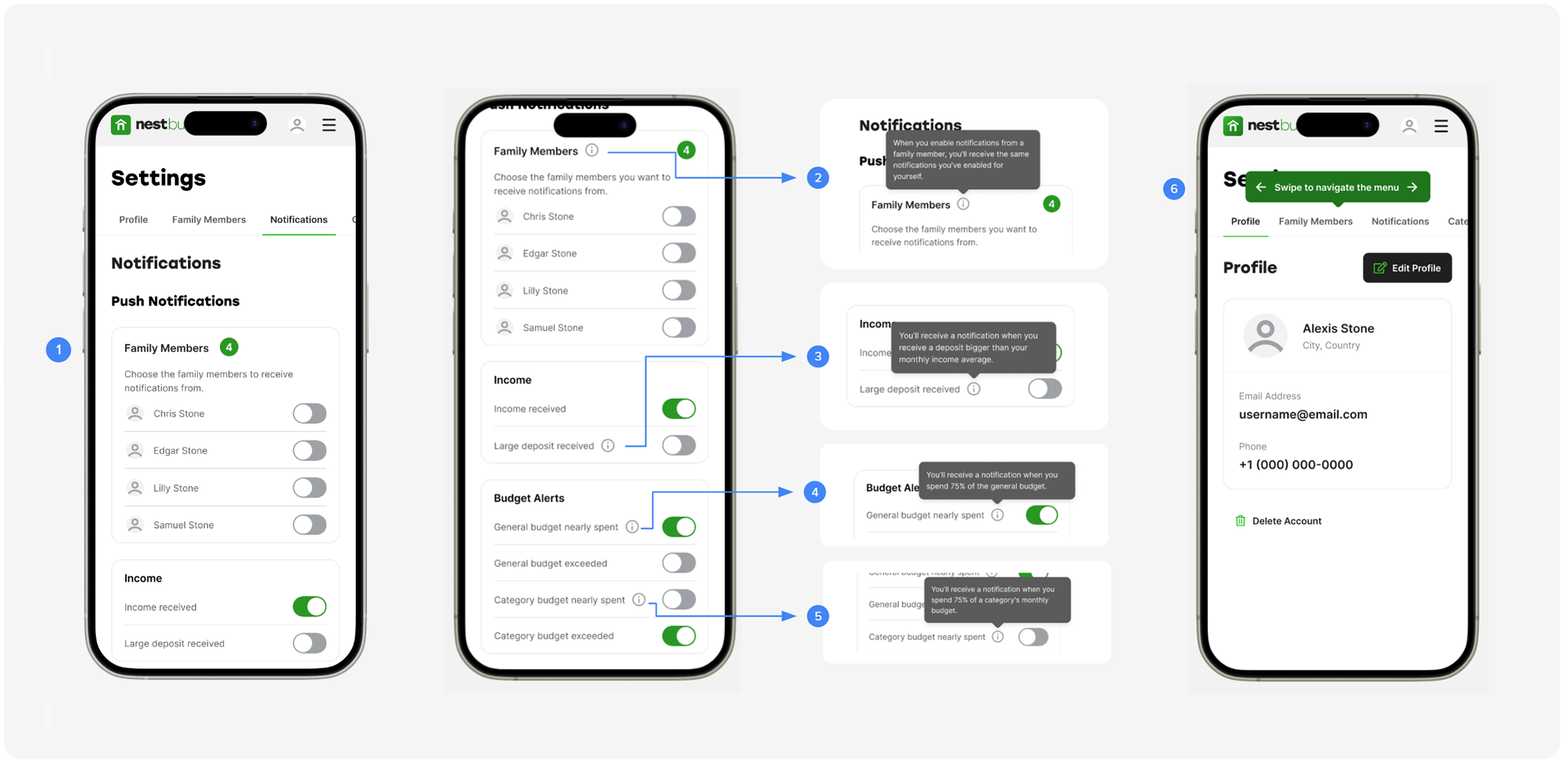
- 1.Aligned 'Family Member' card design with other notifications. Added tooltips for 'Family Members'.
- 2.Implemented tooltips for 'Large deposit received'.
- 3.Introduced tooltips for 'General budget nearly spent'.
- 4.Included a tooltip guiding first-time users to swipe for settings navigation on mobile.
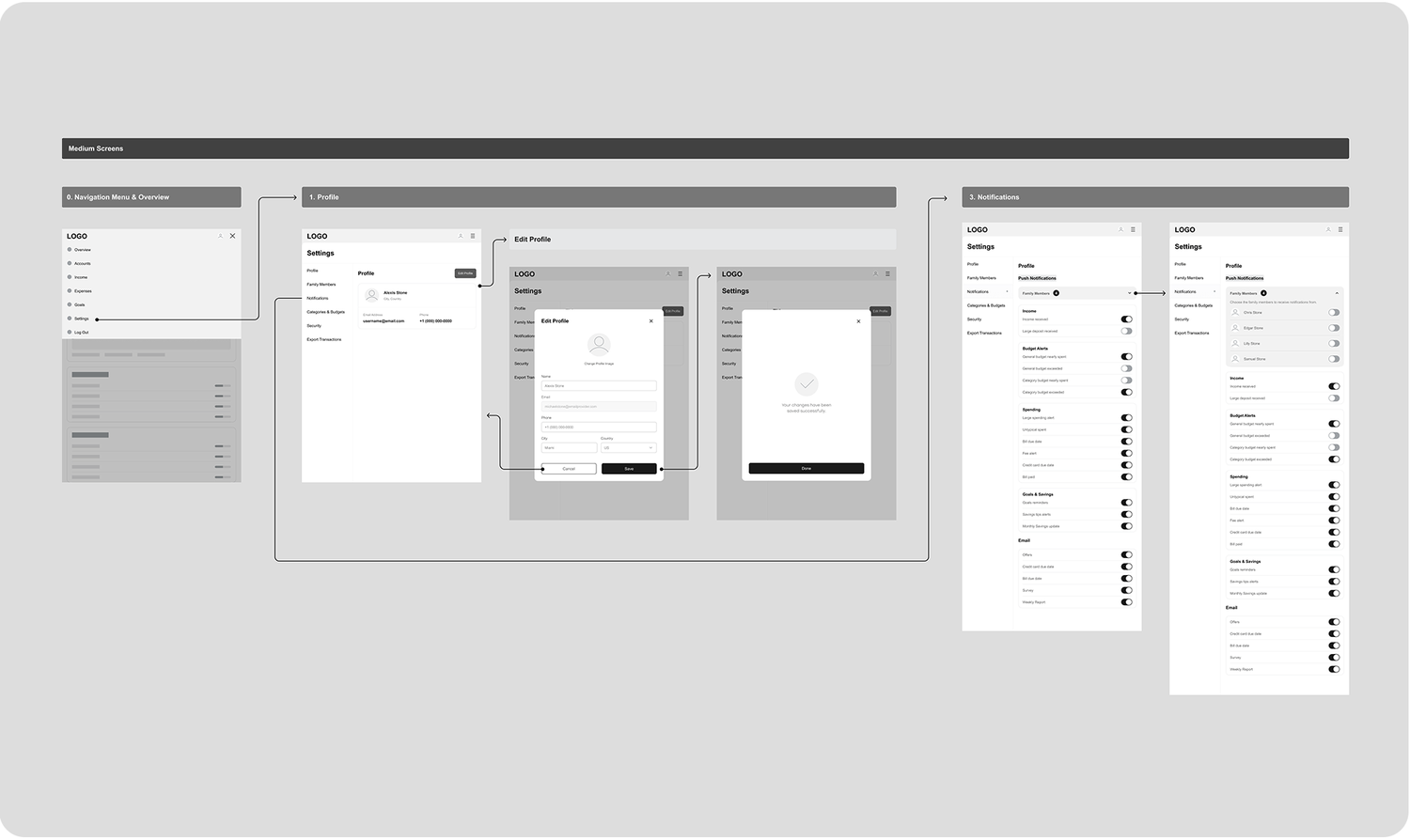
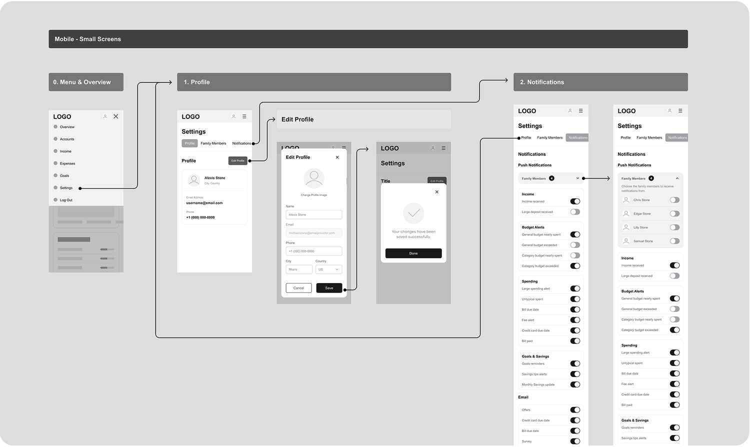
High Fidelity Prototypes
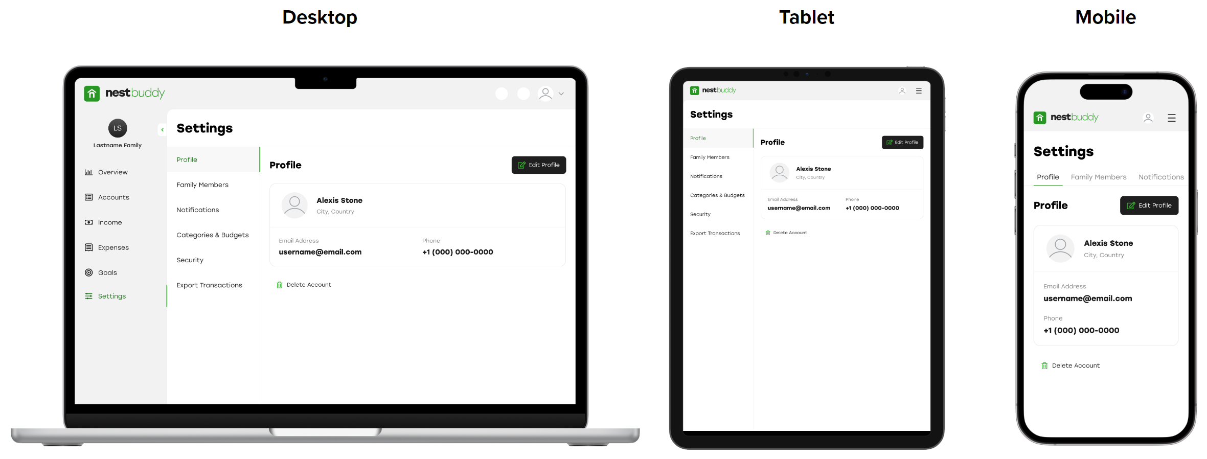
After multiple iterations and two rounds of usability testing, I finalized the high-fidelity prototype for the NestBuddy Settings. The result was a consistent experience across desktop, tablet, and mobile.
Want to learn more about this project?
hello@irvingsuna.com