Smart Business Card, Networking Mobile App

Problem
SendContact lets professionals create and share virtual business cards using NFC. During development, user testing showed the interface was difficult to use, especially for people less comfortable with technology.
Solution
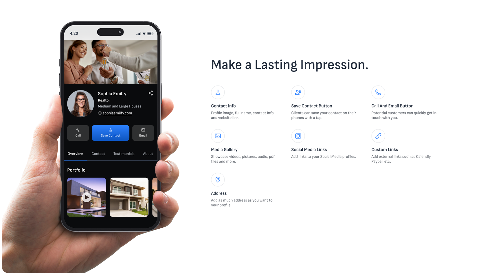
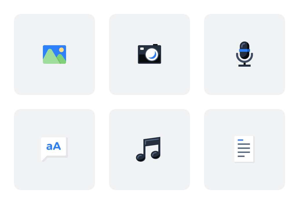
I conducted competitive research and user analysis to find the main friction points, then redesigned the virtual card structure around a minimal, step-by-step creation process. The new interface supports a range of content types: image galleries, videos, audio, text blocks, documents, and social media links, without overwhelming the user.
I also added a guided creation flow that walked first-time users through building their first card step by step, making it easier to get started without prior experience.
Results
The project covered the full design process, from paper sketches to high-fidelity prototypes ready for development handoff. The redesigned app had a clearer card creation flow and a guided onboarding experience for new users.
The redesign addressed the main issues found in user feedback: profile creation, card building, and NFC sharing all became faster and easier to use.
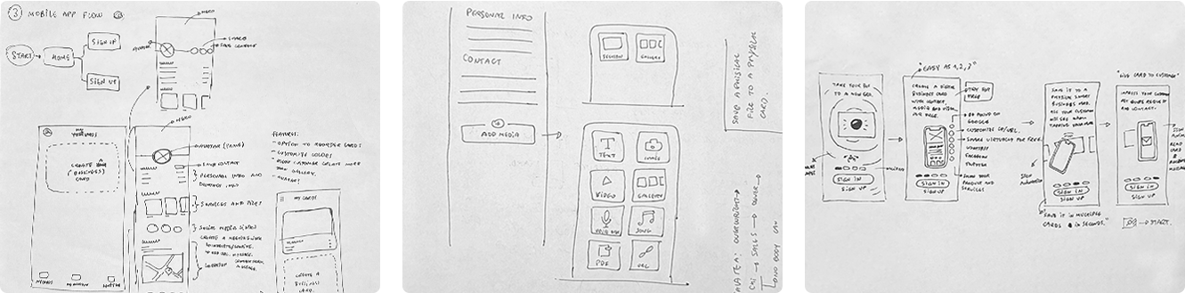
Design Process
Low Fidelity Prototypes
After researching the market and aligning with the client on goals, I redesigned the virtual card structure from the ground up. The initial exploration focused on a minimal interface with a step-by-step creation process, allowing users to add different types of content, including image galleries, videos, audio, text blocks, documents, and social media links, without feeling overwhelmed.
Design Process Overview
The design evolved across four fidelity stages, from initial grayscale sketches and refined low-fidelity layouts, through mid-fidelity dark-themed screens, to the final high-fidelity UI with photography and refined interactions.
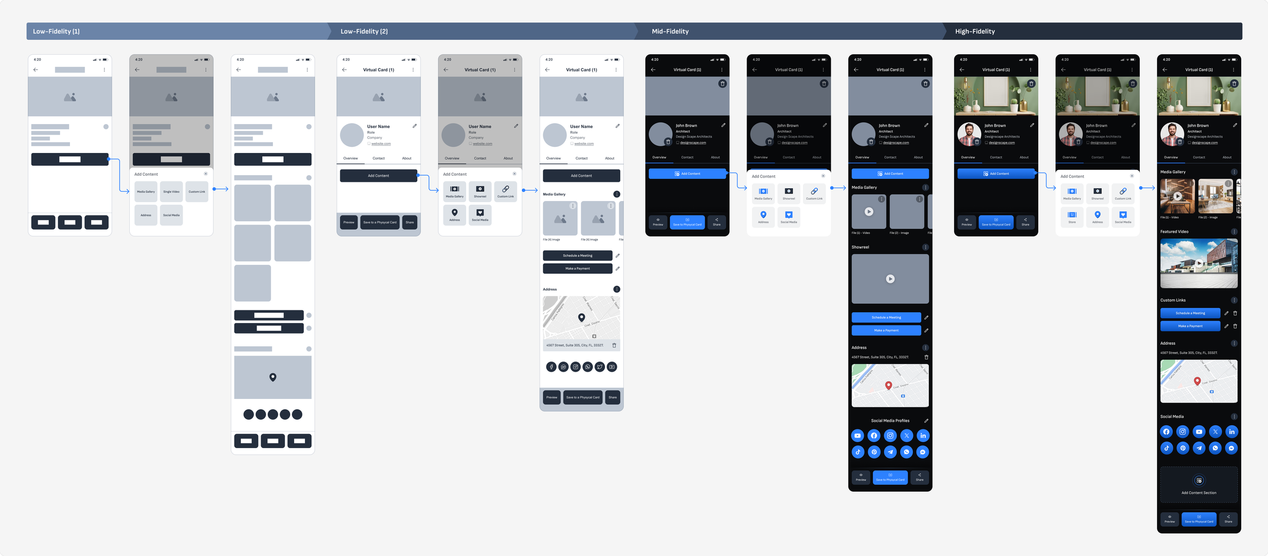
High Fidelity Prototypes
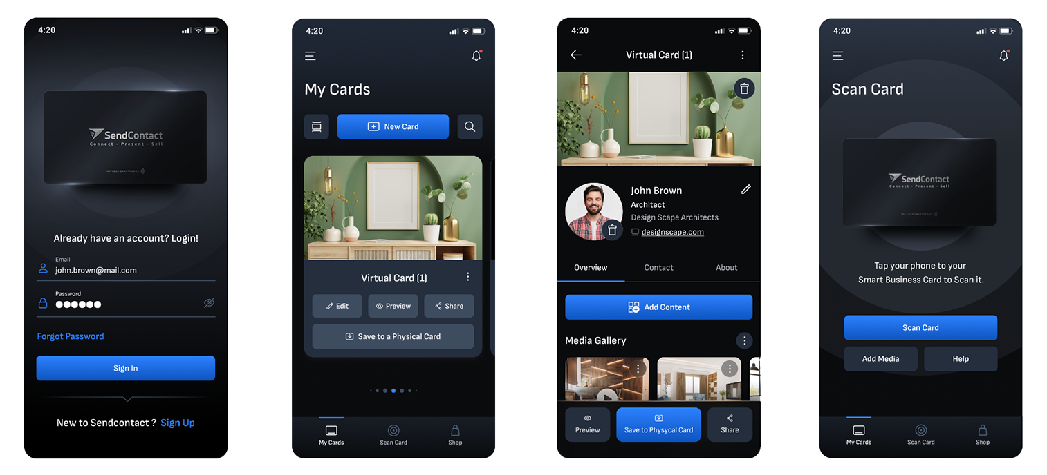
Key Screens
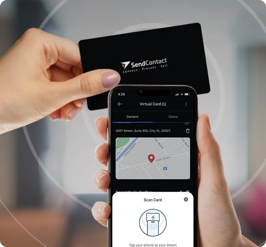
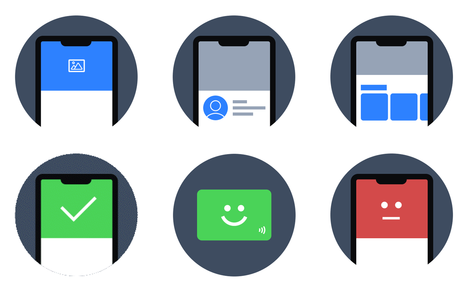
The final high-fidelity design uses a dark visual style that fits the app's professional audience. Core screens include Login, the My Cards dashboard, the Virtual Card detail view, and the Scan Card NFC sharing screen.
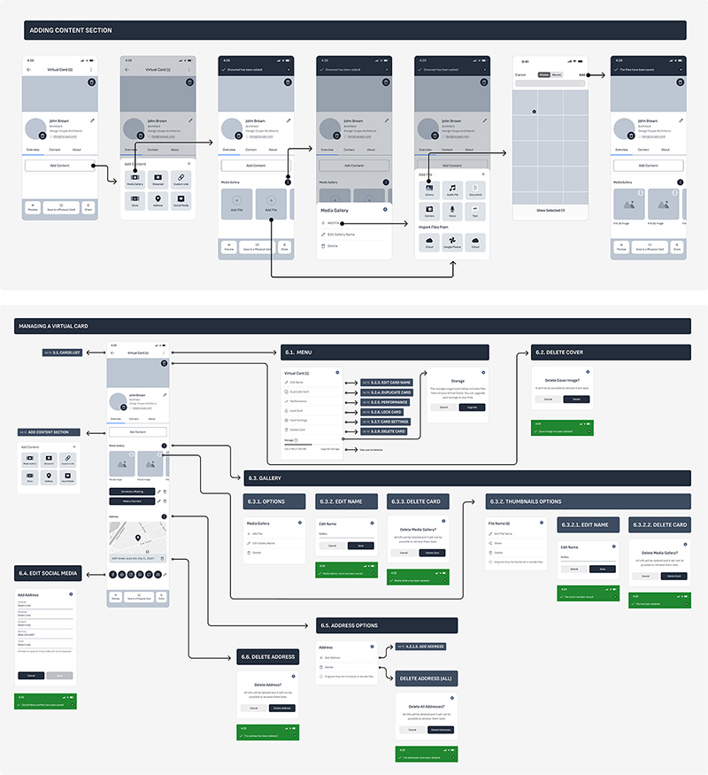
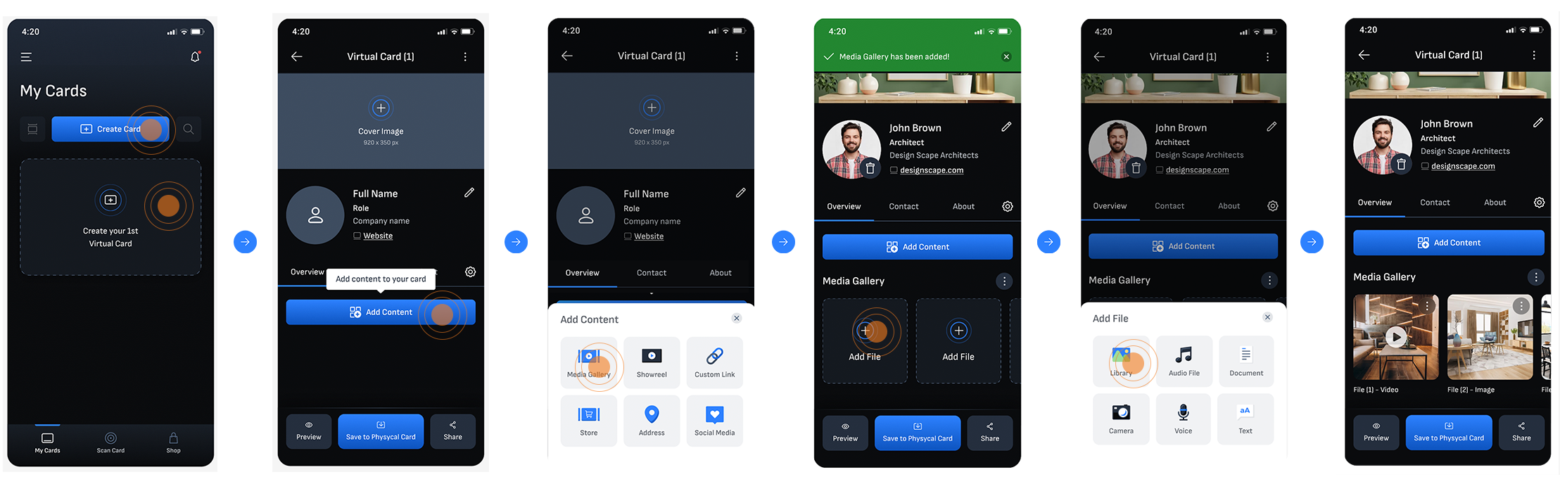
Guided Virtual Card Creation
To reduce the friction first-time users experienced, I designed a guided creation flow that walks users step by step through building their first virtual card. Starting from an empty My Cards screen, users are prompted to add a cover image, fill in their name and details, and then progressively add content, making the process approachable regardless of technical background.
Saving the Virtual Card into a Physical Card
Virtual Card Features
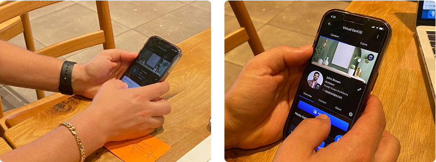
Usability Testing
I conducted usability testing to compare two approaches for creating a virtual card: adding sections one by one versus displaying all sections at once. Users completed the task successfully with both methods, but most preferred seeing all sections upfront.
Changes made based on the users' feedback
Based on the user feedback from testing, I updated the card creation experience to show all content sections at once. This lets users start adding content right away and remove anything that does not apply to them.
New process for creating Virtual Cards:
- 1.Tap on 'New Card'
- 2.Enter information
- 3.Upload images, videos, and files
- 4.Start sharing your virtual card through social media or via Smart Virtual Cards.
Custom Icons and Illustrations
Want to learn more about this project?
hello@irvingsuna.com